![]()
Our 4-Step Logo Design Process
All designers have some time, or in some cases, often get the question: what’s the price for a logo? Here, we will explain why you should not worry too much about the price for a logo and the different logotypes there are.
But before we continue…
This article will be long; it’s simply too much.
So, if you prefer to download the PDF for this article,
A good logo is the cornerstone of a brand’s identity, embodying its values, ethos, and story in a single visual symbol. It serves as the most recognizable representation of the company, differentiating it from competitors and fostering brand loyalty. The importance of a well-crafted logo cannot be overstated; it must be memorable, timeless, and versatile to be effective across various mediums and applications, ensuring that a brand’s impression is strong and consistent.
A logo is more than just a pretty design; it is the face of a brand. It should be unique, eye-catching, and evoke emotions that resonate with the target audience. A well-designed logo can create a lasting impression in the minds of consumers and help establish credibility for a brand.
One crucial aspect of a good logo is its simplicity. A cluttered or overly complicated logo can be overwhelming and fail to make a lasting impact. Keeping the design clean and straightforward ensures the logo is easily recognizable and conveys the intended message.
Another crucial factor in logo design is colour. Colours significantly influence human psychology and can convey different emotions and associations. A well-chosen colour palette can enhance a brand’s message and make a logo more memorable. It is also essential to ensure that the chosen colours are consistent with the brand’s overall visual identity.
Typography also plays a vital role in logo design. The font used in a logo should be legible, appropriate for the brand’s tone and personality, and work well in different sizes. A good rule of thumb is to limit the number of fonts in a logo to no more than two to maintain consistency and avoid clutter.
Different Logo Styles Explored
Logos come in all shapes and sizes, each with its own set of characters and charm. From the sleek sophistication of monogram logos to the relatability of mascot designs, there’s a style to fit every brand’s unique identity. Let’s delve into several popular logo styles, including Wordmarks (Logotypes), Monogram Logos (Lettermarks), Pictorial Marks (Logo Symbols), Combination Mark, Emblem, Abstract Logo Marks, Mascots, and Dynamic Mark, and explore how each type can capture the essence of a brand. Understanding these styles is crucial in crafting a suitable and impactful logo, whether seeking elegance through simplicity or complexity via creativity.
 Wordmark Logos:
A wordmark logo is essentially text-based and focuses on the company name. This type of logo is Powerful for its simplicity and direct approach to presenting the brand to the public. The design hinges on a unique typographic treatment involving a distinctive font or custom lettering. A well-crafted wordmark can communicate a brand’s personality, whether professional, friendly, or avant-garde. It’s not merely about the text but how it is fashioned to convey emotion and recognition.
Moreover, wordmarks benefit from the clarity they provide; they leave little doubt about the company name they represent. This clarity is particularly advantageous for new companies seeking to reinforce their brand identities in the minds of potential customers. Businesses with shorter names or those that consist of one to three syllables are apt to benefit most from this type of logo as it typically makes the brand name straightforward to remember and pronounce.
Creating a memorable wordmark logo also requires consideration of scalability and versatility. It should be as effective on a small business card as on a large billboard. This means the font choice is critical, as it must maintain legibility and impact at varying sizes and across various mediums. For startups and companies aiming to rebrand, a wordmark logo is often a strategic choice due to its innate ability to deliver clear brand messaging in the company name itself.
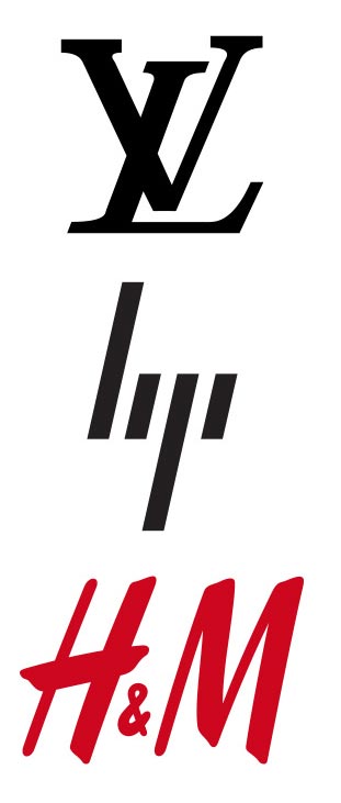
Examples of Wordmark logos are, e.g., Hewlett Packard, CNN and IBM
Pros:
- Brand Recognition: Wordmark logos can help establish strong brand recognition by emphasizing the company or brand’s name. If the brand name is unique or memorable, a wordmark logo can become instantly recognizable, aiding in brand recall among consumers.
- Versatility: Wordmark logos are versatile and adaptable across various mediums and sizes. They can be easily scaled up or down without losing legibility, making them suitable for use on different marketing materials, from business cards to billboards.
- Clarity and Simplicity: Wordmark logos often convey simplicity and clarity in design by focusing solely on typography. They communicate the essence of the brand name directly without the distraction of accompanying symbols or graphics. This simplicity can make them easier for audiences to understand and remember.
Cons:
- Dependency on Name: Wordmark logos heavily rely on the strength and recognition of the brand name itself. The wordmark logo may struggle to stand out or differentiate itself in a crowded marketplace if the brand name isn’t inherently memorable or unique.
- Limited Symbolism: Unlike logos that incorporate symbols or icons, wordmark logos cannot convey symbolism or represent abstract concepts associated with the brand. This can be a drawback if the brand wants to communicate deeper meanings or values through its logo.
- Legibility Issues: Depending on the typography chosen and its execution, wordmark logos can sometimes suffer from legibility issues, especially when scaled down to smaller sizes or viewed from a distance. If the font is overly decorative or intricate, it may become difficult to read, diminishing the logo’s effectiveness.
Letterform (Monogram) Logos:
The Letterform (Monogram) logo is a beautifully simplistic yet potent form of branding. Distilled down to a company’s initials, these logos strip away the complexity often found in more detailed emblems, leaving a strong, easily recognizable mark. The elegance of the letterform logo lies in its minimalist approach, combining letters creatively and distinctively that are often more visually intriguing and easier to remember than a full company name.
True to its minimalist nature, the letterform logo hinges on strong typography and intuitive design. Each letter’s shape, weight, and style are carefully chosen to reflect the company’s ethos and industry positioning. Frequently, these logos are the hallmark of luxury brands, with their sleek and simple construction conveying an air of exclusivity and prestige. Designers often experiment with different typefaces or create a custom font to ensure the logo stands out from competitors and resonates with the target audience.
Using a letterform logo significantly enhances a company’s adaptability across various platforms. Given its compact nature, it scales beautifully from the corner of a smartphone screen to the expansive side of a corporate building. This scalability makes the letterform logo strategically advantageous for businesses that require a versatile symbol for a digital environment where branding real estate is limited yet needs to make a substantial impact. Despite their simplicity, crafting a letterform logo demands a keen eye for design aesthetics and a strategic understanding of brand representation to ensure the initials alone can carry the full weight of the company’s identity.
Examples of Wordmark logos are, e.g., Yahoo, AirBnB, and Uber
Pros:
- Memorability: Monogram logos can be highly memorable due to their simplicity and uniqueness. When well-designed, they can leave a lasting impression on the audience, making it easier to recall the brand or individual associated with the logo.
- Versatility: Letterform logos often offer versatility in terms of application. They can be scaled easily, making them suitable for various contexts, such as business cards, websites, merchandise, and signage, without losing their legibility or impact.
- Elegant and Sophisticated: Monogram logos can convey elegance and sophistication, particularly when designed carefully for typography and aesthetics. They are often favoured by luxury brands or businesses aiming to project a refined image.
Cons:
- Limited Representation: While monogram logos can effectively represent a company or individual’s initials, they may lack the ability to convey more complex messages or brand attributes compared to logos incorporating symbols or imagery. This limitation could potentially hinder brand storytelling and recognition in certain contexts.
- Potential Confusion: In some cases, monogram logos can be confusing if the initials are not instantly recognizable or if they resemble other existing logos or symbols. This can lead to brand identity and differentiation issues, especially in competitive markets.
- Dependency on Typography: The effectiveness of a monogram logo heavily relies on the typography and design elements used. If the typography is poorly chosen or executed, the logo may fail to make a strong impression or be perceived as generic. Additionally, changes in typography trends may necessitate periodic updates to keep the logo relevant.
Abstract And Pictorial Marks Logos (Symbols):
Symbol or icon-based logos harness the power of imagery to capture a company’s identity in a memorable visual. These symbols become the cornerstone of a brand’s image and can communicate complex ideas or emotions in an abstract or representational way. They are designed to be simple yet bold, making them easily recognizable. The universality of such logos allows them to transcend language and cultural barriers, which is crucial for companies operating on an international scale. Brands like Apple and Nike exemplify the effectiveness of using a symbol by creating icons instantly associated with their products and values worldwide.
These logos also offer remarkable versatility, as they can be used across various mediums and applications without losing their identity. Whether on a product, a billboard, an app icon, or social media, a symbol logo maintains consistency and recognition. The simplicity of the design often means it’s scalable, functioning well at different sizes and in both colour and black and white. This scalability and adaptability are increasingly important in the digital age, where a company’s logo must perform across different devices and platforms. The key to a successful symbol logo is its ability to tell a brand’s story through a single emblematic design. So what is the price for a Pictorial Marks Logos? Well, it varies a lot between the companies. Here at Mallorca Graphics, we charger you 175€.
Examples of Wordmark logos are, e.g. Apple, Twitter, and Shell
![]()
Pros:
- Memorable and Unique: Abstract and pictorial marks have the potential to be highly distinctive, making them easier for consumers to remember. When well-designed, they can leave a lasting impression on the audience.
- Versatility: These types of logos are often versatile in terms of application. They can be scaled up or down without losing clarity, making them suitable for print, digital, merchandise, etc.
- Universal Appeal: Abstract and pictorial marks can transcend language barriers. They rely less on text and can communicate a brand’s message or identity more universally, making them suitable for businesses with diverse target audiences.
Cons:
- Potential for Misinterpretation: One drawback of abstract and pictorial marks is that they may be open to interpretation. Without clear context or explanation, viewers may not immediately understand the intended message or connection to the brand.
- Complexity: Some abstract or pictorial designs can be intricate, which may pose challenges in reproducing them accurately across different platforms or mediums. Complexity can also make the logo less adaptable for certain applications.
- Dependency on Brand Building: Unlike logos that incorporate text, abstract and pictorial marks may require more effort to establish brand recognition initially. They rely heavily on effective branding strategies to ensure consumers associate the symbol with the brand over time.
Combination Mark Logos:
Combination mark logos are adept at conveying a brand’s message with clarity and versatility by fusing typographic and symbolic elements. This type of logo is exceptionally beneficial for new businesses that strive to build brand recognition. Since the symbol or icon can pique interest and the accompanying text clearly states the brand name, combining the two can help audiences remember and identify the brand more quickly than with a symbol or text alone. For instance, the Starbucks logo features its iconic mermaid symbol and brand name in a surrounding circle, effectively marrying imagery with text to promote brand identification.
These logos also allow companies to use either or both elements across different mediums, which is crucial for branding consistency as a business grows and evolves. The full combination mark can be used professionally for a complete brand presentation. In contrast, the symbol or icon can function independently in social media avatars, app icons, or product branding where space is limited. Adidas is a notable example, often using its recognized three-stripe symbol independently from its full logo during advertising. Yet, the association with the brand remains unmistakable due to the strength of its combination mark.
Examples of Wordmark logos are, e.g., Pizza Hut, PayPal, and Pepsi
Pros:
- Versatility: Combination marks offer versatility in branding. They allow for both the symbol/icon and the wordmark to be used together or separately, giving businesses flexibility in their marketing materials. This versatility enables effective branding across various platforms and mediums.
- Memorability: By combining a symbol/icon with a wordmark, combination mark logos can enhance memorability. The visual element helps create a distinct image in consumers’ minds, while the wordmark reinforces the brand name. This dual reinforcement can aid in brand recognition and recall.
- Scalability: Combination marks tend to be more scalable than logos that rely solely on a symbol or a wordmark. They can be resized without losing impact, making them suitable for various applications, from small business cards to large billboards. This scalability ensures consistent brand representation across different sizes and formats.
Cons:
- Complexity: Combining a symbol/icon with a wordmark can sometimes lead to a visually complex logo. If not executed properly, this complexity can make the logo difficult to read or understand, especially in smaller sizes. To maintain clarity, it’s crucial to balance the symbol/icon and the wordmark.
- Risk of Overcrowding: There’s a risk of overcrowding the design space with combination mark logos. If the symbol/icon and the wordmark are overly elaborate or detailed, they may compete for attention and create visual clutter. This can dilute the logo’s impact and make it less effective in conveying the intended message.
- Dependency on Recognition: Combination mark logos may rely heavily on consumers recognizing the symbol/icon and the wordmark for effective branding. The logo’s impact could be diminished if either component lacks recognition or association with the brand. Achieving balanced recognition and association between the symbol/icon and the wordmark is essential for successful combination mark logos.
Emblem Logos:
Emblem logos are heralded for their classic appearance and ability to encapsulate a brand’s heritage, authority, and gravitas within a cohesive design. These logos often mimic the style of official crests, stamps, or seals, which lends them an air of established credibility and formality. They are frequently chosen by organizations that wish to project a storied history or an institutional weightiness, making emblems highly popular among schools, government agencies, automobile companies, and professional sports leagues. The intricacies and detail within emblem designs can communicate a sense of craftsmanship and timelessness, as seen in the intricate design of the Harley-Davidson logo.
However, emblems’ detailed and often intricate design can present challenges in the digital age, where logos must be legible across various formats and sizes, from mobile screens to massive billboards. Despite this, emblems remain a strong brand choice, emphasising their enduring legacy and reliability. To maintain versatility, modern emblem logos are often designed with simplicity in mind, ensuring that their most important elements remain clear and distinguishable even when scaled down. For example, the NFL’s shield logo retains its recognizability across merchandise, television broadcasts, and digital platforms, a testament to the emblem’s adaptability when thoughtfully designed.
Examples of Wordmark logos are, e.g. BMW, NHL, and UPS
Pros:
- Classic and Timeless Appeal: Emblem logos often convey a sense of tradition, heritage, and authenticity. They can evoke a classic, timeless feel that resonates well with audiences, particularly for brands aiming to establish a strong sense of history or credibility.
- Distinctive Brand Identity: The enclosed nature of emblem logos allows for a clear and distinctive representation of the brand. By combining symbols, icons, and text within a unified design, emblem logos can create a unique visual identity that helps the brand stand out in a crowded marketplace.
- Versatility in Application: Emblem logos can be versatile, as they can work well across various mediums and sizes. Whether on a business card, a website, or a product packaging, emblem logos can maintain their visual impact and legibility, offering consistency in brand representation.
Cons:
- Complexity and Detail: Emblem logos tend to be more complex and detailed compared to other logo types like wordmarks or lettermarks. This complexity can sometimes make them less suitable for certain applications where simplicity and scalability are crucial, such as digital platforms or small promotional items.
- Limited Flexibility for Rebranding: Because emblem logos often incorporate intricate design elements, they may be less flexible when rebranding or adapting to company identity changes. Altering or updating an emblem logo while maintaining its recognizability can be challenging and may require significant redesign efforts.
- Legibility Challenges: Depending on the design and size, emblem logos may face legibility challenges, especially when scaled down or viewed from a distance. Suppose the text within the emblem is too small or the symbol too intricate. In that case, it can hinder readability and recognition, impacting the logo’s effectiveness in communicating the brand name or message.
Mascot Logos:
Mascot logos are more than just visual identifiers; they encapsulate a brand’s narrative, character, and ethos through a relatable figure or persona. These mascot characters often embody traits the brand wants to project, such as friendliness, reliability, or whimsy, enabling customers to forge a more personal or emotional connection with the brand. Through mascots, companies can communicate their values and messages entertainingly and memorably.
For example, the KFC mascot, Colonel Sanders, is not just an illustrated character; he represents the company’s origin and heritage, dressed in the iconic white suit and bow tie that speak of tradition and quality. Similarly, the Michelin Man, known as Bibendum, embodies the durability and reliability of Michelin tyres with his sturdy, tire-composed body, reinforcing the product’s key attributes in a way audiences can instantly recall.
These characters often become so synonymous with the brand that they can stand independently, serving as powerful marketing tools across various campaigns and evolving with the brand over time. In addition to becoming the face of the product, they are also utilized in animations, commercials, and merchandise, further cementing the brand’s image in the marketplace. The ability of mascots to transcend cultural and language barriers is especially useful for global brands, as the mascot’s imagery and characteristics can be universally recognized and appreciated.
However, creating a successful mascot logo requires thoughtful design and strategic marketing. The mascot must be appealing, adaptable to different media formats, and appropriate for the target audience. Moreover, it should remain relevant and be able to evolve without losing its core identity. When brands get it right, as with Tony the Tiger for Kellogg’s Frosted Flakes, the mascot becomes an enduring symbol that generations of consumers grow to know and love. And the price for a logo like this? In Mallorca Graphics, we have a set price for a logo, and the price for a logo is always the same.
Examples of Wordmark logos are, e.g., KFC, Android, and Lacoste
Pros:
- Memorability: Mascots can make a brand more memorable. When a unique and engaging character represents a brand, it can stick in the minds of consumers more effectively than abstract logos or simple wordmarks. This can help with brand recognition and recall.
- Emotional Connection: Mascots have the potential to evoke emotions and create a connection with the audience. A well-designed mascot can elicit feelings of joy, nostalgia, or trust, helping to forge a stronger bond between the brand and its customers.
- Versatility: Mascot logos offer versatility in branding and marketing efforts. They can be adapted to various contexts, such as advertisements, merchandise, social media campaigns, and events. Mascots can also be animated or portrayed in different poses to suit messaging needs.
Cons:
- Risk of Misinterpretation: Mascot logos risk being misinterpreted or not resonating with all audiences. Depending on cultural differences, personal preferences, or evolving societal norms, what one group finds appealing, another might find off-putting or offensive.
- Complexity: Mascot logos can be more complex to design and execute than other logos. Creating a well-designed mascot that effectively represents the brand’s identity while remaining visually appealing and versatile can require significant time, effort, and resources.
- Potential to Overshadow the Brand: In some cases, a mascot may become more recognizable than the brand itself. While this might seem like a positive outcome initially, it can become problematic if consumers primarily associate the mascot with certain qualities or attributes not aligned with the brand’s overall message or objectives.
Dynamic Mark Logos:
Dynamic mark logos testify to a brand’s flexibility and responsiveness to the ever-changing cultural and digital landscapes. A dynamic mark isn’t static; it morphs and evolves to reflect events, trends, and user interactions, achieving a level of engagement that traditional logos cannot match. Google’s daily-changing Doodle provides an excellent example, with its clever and often educational alterations that commemorate holidays, anniversaries, and notable figures, thereby keeping the brand fresh and top-of-mind. They also serve as conversation starters and invitations for users to interact with the brand more frequently and personally.
In addition to their interactive appeal, dynamic marks allow a brand to display its creative acumen and innovative approach. For instance, MTV’s dynamic logo retains its core typeface. Still, it changes its background and texture depending on its usage, reflecting music’s diverse and eclectic nature and the youth culture it represents. This adaptability can be particularly advantageous when targeting younger demographics known for valuing novel and authentic experiences. Moreover, in an age where digital platforms dominate consumer attention, the ability of a logo to adjust and play within various contexts becomes invaluable, giving the brand a vibrant and perpetual presence.
Examples of Wordmark logos are, e.g., Casa Da Musica, Nickelodeon, and MIT.
Pros:
- Versatility: Dynamic mark logos offer a high level of versatility, as they can adapt to different mediums, sizes, and contexts. This ensures consistency in branding across various platforms, from digital to print and from small-scale to large-scale applications.
- Engagement: These logos can enhance user engagement by providing an interactive and dynamic experience. They can respond to user actions or environmental factors, making them more memorable and engaging for the audience. This interactivity can foster a stronger connection between the brand and its audience.
- Future-proofing: Dynamic mark logos can potentially future-proof a brand’s identity in a rapidly evolving digital landscape. As new technologies and platforms emerge, these logos can adapt and evolve accordingly, ensuring the brand remains relevant and up-to-date.
Cons:
- Complexity: Designing and implementing dynamic mark logos can be more complex and time-consuming than static logos. It requires careful consideration of how the logo will adapt across different contexts and platforms, which may involve additional design iterations and testing.
- Consistency: While dynamic mark logos offer versatility, maintaining consistency across all adaptations can be challenging. Variations in size, shape, and context may lead to inconsistencies in the logo’s appearance, potentially diluting the brand’s identity if not managed effectively.
- Technical Limitations: Implementing dynamic mark logos may require specific technical expertise and resources, particularly for interactive or responsive designs. Compatibility issues across different devices, browsers, or platforms could impact the logo’s effectiveness and user experience.
The Power of Brand Symbols in Anchoring Identity
Logos are beyond mere graphical symbols; they embody a brand’s identity, values, and story. Through thoughtful design and strategic application, they become intrinsic to a brand’s recognition and are crucial to forging a lasting relationship with consumers. Whether it’s a timeless symbol like the NFL shield or a dynamic, ever-changing mark like Google Doodles, logos anchor the brand ethos in the consumers’ minds.
Therefore, a logo’s design must be undertaken with great care and an understanding of the brand’s core message. The goal is to encapsulate the company’s spirit in an eye-catching visual form that evokes its audience’s intended emotions and concepts. Abstract marks often challenge this by representing global aspirations and abstract values, inviting individual connection and interpretation, as seen with Pepsi’s vibrant globe logo.
Animated characters, or mascots, take a different approach by narrating the brand’s story in a vivid, often endearing manner. They offer a personality and distinctiveness that can turn a company into a beloved household name, as with Colonel Sanders of KFC or Tony the Tiger for Kellogg’s Frosted Flakes. When leveraged correctly, these figures bridge the gap between the brand and its customers across generations and cultures.
Lastly, embracing the concept of a dynamic mark can showcase a brand’s agility and contemporary essence. Google and MTV illustrate how a brand can remain relevant and engaging by transforming its logos according to current events or cultural trends. This reinvention keeps the conversation going and ensures that the brand’s image never stagnates in the collective consciousness.
Ultimately, the success of these brand symbols—emblem, abstract, mascot, or dynamic—is intertwined with their ability to adapt, resonate, and remain memorable. As ambassadors of the brand’s image, they play an indispensable role in navigating the competitive landscapes of today’s marketplaces. Through these symbols, brands narrate their story, carve their niche, and ultimately, win their customers’ hearts.
Enhancing Your Brand with Mallorca Graphic Design
Mallorca Graphic stands at the forefront of graphic design, offering creative solutions that propel brands to new heights. As custodians of your business’s visual identity, Mallorca Graphic can turn an ordinary brand into an extraordinary household name. Specializing in a wide array of bespoke graphic design services, Mallorca Graphic has the expertise to craft logos and branding materials that truly reflect the essence of your business. We understand the importance of storytelling and engaging with clients to ensure the design looks visually appealing and encapsulates the brand’s core values and message.
The process at Mallorca Graphic begins with a deep dive into your brand’s mission, vision, and target audience. By aligning with your business goals, we will create a logo and an entire visual identity system that resonates with your market and stands out in a crowded marketplace, whether you’re after an emblematic logo that conveys tradition and reliability, a mascot that adds a narrative charm, or a dynamic mark that highlights your brand’s adaptability, we bring your ideas to life, and we understand that a logo is more than just artwork—it’s a critical marketing tool that can attract and retain customers.
Mallorca Graphic ensures your visual identity is prepared for the digital landscape with optimised web, social media, and traditional media designs, maintaining brand consistency across all touchpoints.
With Mallorca Graphic, you’re not just getting a logo; you’re setting the cornerstone of your brand identity that will tell your story and echo its principles long into the future.
What is the price for a logo?
I often asked, “What is the price for a logo?” So, instead of seeing this as a cost, it should be seen as an investment for your company. The price for a logo design at Mallorca Graphics is 175€.
Startups may opt for a cheaper solution to align with their budget; however, this could be very costly in the long run. You should never sacrifice the quality or effectiveness of your logo. At the heart of the matter is the value the design brings to your brand, how it communicates your message, and its potential to stand the test of time.
It’s prudent to consider your logo as part of a broader branding strategy, including your website, promotional materials, and packaging. When viewed as a part of this larger spectrum, the return on investment becomes clearer. An exemplary logo design can elevate your entire brand, create a lasting impression on your customer base, and distinguish you from competitors. Mallorca Graphic recognizes these nuances and is dedicated to balancing quality and cost-efficiency to provide a comprehensive branding solution that aligns with your vision.
So whether you are a startup and need a logo or rebranding, the price for a logo is often the last thing you should worry about.
Do you want to read more about logos? Check Wikipedia
If you have any questions, do not hesitate to Contact Us.